Bayside Gamers
Review by Kino
First Impressions
[note]========== BEGIN - First Impressions ==========[/note]
Alright so at first site you log on and see a pretty basic design of a website or blog. Not quite sure what exactly you are focusing on. Seems you have a forum, website, and blog. Hmm. Maybe try to narrow down what you are offering. Just my first thought when I opened up.
I love the "Welcome to Bayside Gamers" orange box right from the start trying to get me to either sign in or sign up. I think that is always something crucial to have when opening a site. Why not attract users to join right away? I mean even if you don't require registration to view content, this is a nice little trick to make people think they need to sign up to view the content. Nicely done.
As I scroll down the site I'm just a little confused with all of the "content" that hits me. I will talk about it more under design, but as a first impression I'm a little bit confused and that isn't always good.
[note]========== END - First Impressions ==========[/note]
Good
Design Quality
[note]========== BEGIN - Design Quality ==========[/note]
So let's have a chat about your design. First thing, I'm not a huge fan of the logo. It's very plain and simple. I think for a gaming site, you need something catchy right from the get go. Also, your logo doesn't really match any of the color scheme you are offering on your theme. You have primarily white and this brown-orange color. Try to maybe incorporate a custom logo with some text or maybe a couple of gaming icons (i.e. Master Chief, Niko Bellic, GTA V characters, etc.)
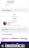
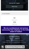
So like I mentioned above I'm very confused as I scroll down. Is this a forum or blog? I see an "Images" section followed by "Competition," a bunch of random pictures in little squares, "Files," an advertising section, and then "Forum Statistics." So just try to follow that timeline there and let's break it down.
Any first time user of a website/forum won't know what exactly you are trying to offer. Not sure what kind of mod you are using on your homepage, but I think you should structure your content a little better. Maybe a "Newest Forum Topics," then the Image gallery, then your top blog posts (with no images) and then your adverts, and finally the forum stats. I think that gives it a more structured layout.
Overall, you need a major revamp of the homepage. It's confusing, hard to navigate, and just really needs some structuring.
[note]========== END - Design Quality ==========[/note]
Poor
Spelling & Professionalism
[note]========== BEGIN - Spelling & Professionalism ==========[/note]
I scrolled through a couple of your "blog" posts and noticed a few issues. So I like the content you are trying to write about, but you're making some grammatical mistakes that are costing you professionalism points (as I like to call them).
I would just make an effort to really proofread every post you're going to make. If you type a lot of posts ahead of time to store and then release on your blog (which I recommend) you should have plenty of time to edit and proof your post.
Some of the mistakes I caught was missing commas, weird apostrophes, run-on sentences, and paragraph structure. I'm not the best writer, but sometimes you just really have to take your time to read and structure your writing properly.
[note]========== END - Spelling & Professionalism ==========[/note]
Average
Final Remarks
Don't let the two star review discourage you. You have an excellent start to what could be a potentially successful website. However, you just need some basic work, as any site, does. Remember, these are suggestions to help you, not to make you feel bad. Use what we all say and remember, never give up.
Your Score