

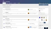
evening all,
Website

 chatbanter.com

any feedback would be great! thanks!
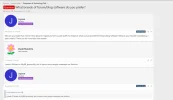
Website
Chat about what matters to you right now.
Chat with fellow members. Grow your social network.
any feedback would be great! thanks!
Last edited:


.png")


