

You are using an out of date browser. It may not display this or other websites correctly.
You should upgrade or use an alternative browser.
You should upgrade or use an alternative browser.
Forum Logo FP$ or $
- Thread starter Deathstarr
- Start date

Deathstarr
Resident
looking for something more modern? I think would be the correct term?


Deathstarr
Resident


D
Deleted member 50656
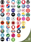
One of the core aspects of logos and branding, especially for marketing, is centred around a principle of simplification. So, normally a logo will have various forms, but is recognisable immediately at all levels. For example:That’s nice but I am looking for the logo part not words or text.
Think major brand logo you recognize anywhere.

I think a lot of the logos in this thread match that process quite well: They start off big, but there's an element in each one that can be downscaled as needed and there's still that "central icon" that is instantly recognisable 🙂
Deathstarr
Resident
Thank you to all the submissions, each are unique and adds it own twist to the dynamic of the forum. I am currently deciding which way I want to go and will let you know.
@Deathstarr
Here's my attempt.

Color can easily be changed as well if you'd like it to be black, white, etc. Text can be removed easily, As well as the overlay would be gone upon purchase if you like it (obviously)
Here's my attempt.
Color can easily be changed as well if you'd like it to be black, white, etc. Text can be removed easily, As well as the overlay would be gone upon purchase if you like it (obviously)
Last edited:


About Us
Since 2007, Forum Promotion has specialized in providing advertising solutions to webmasters looking to promote their communities. We pride ourselves in being the bridge that connects forum administrators, bloggers, and more.
Affiliates


