D
Deleted member 32117
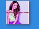
So I made a logo just wanted your all thoughts on it. EDIT: I can the image is going off the logo a bit I tired fixing but couldn't also its been made on Pixlr


You did probably I didn't see it for the second one anyways thanks 🙂 I will try to make more not Ariana ones but Different onesThought I already responded but I really like that artwork! Keep it up 🙂
Also you should try GIMP if you haven't already. It is a quite good image editor which is free and open source, although is quite hard to get grip of.
And thanks for joining my board earlier, I appreciate it 🙂
i think the size of the pink shape is unnecessarily large in this caseSo I made a logo just wanted your all thoughts on it. EDIT: I can the image is going off the logo a bit I tired fixing but couldn't also its been made on Pixlr
Just a banneri think the size of the pink shape is unnecessarily large in this caseSo I made a logo just wanted your all thoughts on it. EDIT: I can the image is going off the logo a bit I tired fixing but couldn't also its been made on Pixlr
and in my opinion, ariana does not look very fancy cause she is too pink, the transparency is not low enough, you probably better off with putting her on top of it, not underneath the shape layer
also just curious, for what are you using this logo, a forum or something? if it was not meant for anything to represent i think the term logo is not appropriate ? more a banner or something? 😛
Since 2007, Forum Promotion has specialized in providing advertising solutions to webmasters looking to promote their communities. We pride ourselves in being the bridge that connects forum administrators, bloggers, and more.


We use essential cookies to make this site work, and optional cookies to enhance your experience.