

You are using an out of date browser. It may not display this or other websites correctly.
You should upgrade or use an alternative browser.
You should upgrade or use an alternative browser.
NCIS-Fan.com graphics
- Thread starter squeeksplace
- Start date
Patrick W.
Addicted
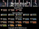
The glow on the images is too strong. If you insist on using a glow on the text, drop the size to 1px and use a color that is either a tad darker or a tad lighter then the text to make it not stand out so much from behind.
The emboss is not too bad, but again, is too much. I am not familiar with the emboss feature of PS, but if it possible, make the emboss lower. This may also change with the glow being dropped to 1px, not sure.
A good way to make text pop off the image, and is the way that I was taught, is to use a stoke, 1px in size, with a color that does not stand out too much. Usually black is the go to color for a stoke, but seeing as the images are black, you may be better off going with a slightly lighter color then the text. You could also drop a shadow of a slightly darker color then the text, 1px in size and 1px in distance, to help the text pop.
You are getting better the more you do. Keep up the good work squeek. I look forward to seeing your next creation. 🙂
Patrick W. said:The glow on the images is too strong. If you insist on using a glow on the text, drop the size to 1px and use a color that is either a tad darker or a tad lighter then the text to make it not stand out so much from behind.
The emboss is not too bad, but again, is too much. I am not familiar with the emboss feature of PS, but if it possible, make the emboss lower. This may also change with the glow being dropped to 1px, not sure.
A good way to make text pop off the image, and is the way that I was taught, is to use a stoke, 1px in size, with a color that does not stand out too much. Usually black is the go to color for a stoke, but seeing as the images are black, you may be better off going with a slightly lighter color then the text. You could also drop a shadow of a slightly darker color then the text, 1px in size and 1px in distance, to help the text pop.
You are getting better the more you do. Keep up the good work squeek. I look forward to seeing your next creation. 🙂
^
squeeksplace
Up-and-Coming Sensation
Patrick W. said:The glow on the images is too strong. If you insist on using a glow on the text, drop the size to 1px and use a color that is either a tad darker or a tad lighter then the text to make it not stand out so much from behind.
The emboss is not too bad, but again, is too much. I am not familiar with the emboss feature of PS, but if it possible, make the emboss lower. This may also change with the glow being dropped to 1px, not sure.
A good way to make text pop off the image, and is the way that I was taught, is to use a stoke, 1px in size, with a color that does not stand out too much. Usually black is the go to color for a stoke, but seeing as the images are black, you may be better off going with a slightly lighter color then the text. You could also drop a shadow of a slightly darker color then the text, 1px in size and 1px in distance, to help the text pop.
You are getting better the more you do. Keep up the good work squeek. I look forward to seeing your next creation. 🙂
thanks as always for your help Patrick. i'll see what i can do and will add v2 soon
About Us
Since 2007, Forum Promotion has specialized in providing advertising solutions to webmasters looking to promote their communities. We pride ourselves in being the bridge that connects forum administrators, bloggers, and more.
Affiliates


