Opinions Please

Teg

Seasoned Veteran
Joined
Dec 6, 2010
Messages
3,459
Reaction score
262
FP$
4,107
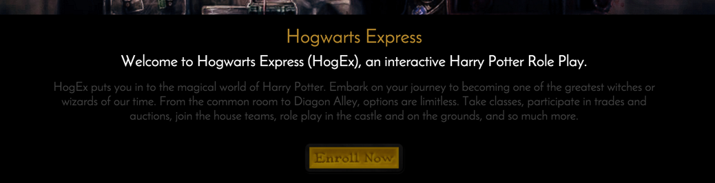
So, since November of 2015, I've been working on a huge Harry Potter RP forum. The forum features a very custom design; custom plugins are being built to include a readily usable House Points Plugin; a Customized monetary system and shop plugin that will allow users to "use" items that they purchase; Hogwarts classes, and much much more.

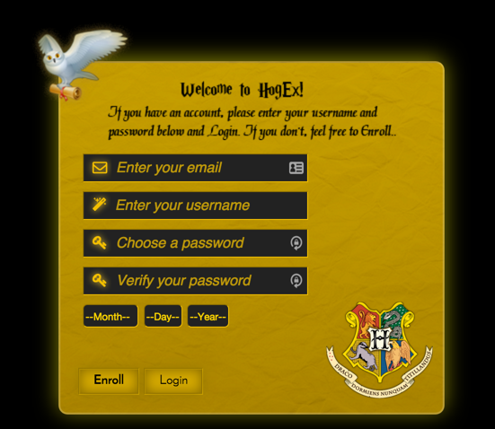
Now, some design aspects are only available to members such as the sidebar, announcements displayed a certain way and more.

Users are sorted into a house and then have access to their common room. There are over 200 forums and sub-forums on this project. That said, we are building custom image maps to make navigation easy for users and allow them to access all areas of the forum without having to see overwhelming amounts of links everywhere for sub-forums. We are still in building mode for the project as we speak, and we're working as quickly as possible to create all of the maps. An example of what I mean by image map is located at http://hogexrpg.forums.net/board/6/support. If you look at the picture at the top center of that particular board, each of the items on the "corkboard" is clickable. They are outlined with a color, and when you hover over an image on the board, it will tell you where clicking the item will take you. The idea is to have any forum that contains sub-boards to be displayed as such with image maps.

So, what do you think of the idea, concept, and design of this project so far? Is there anything related to the idea, concept or design that you believe that we should change or add?

http://hogexrpg.forums.net
 
Nice site! The design is very, very well done. There are some points where the usability could use some work, though. Here are a few examples:

01696d71e968f295b60d19353c6353cb.png


One common issue throughout the site is that the text isn't very readable. When designing a user interface or website, it's important to put usability before aesthetics, in that text should be readable, even if it doesn't look as good. I'm mostly referring to the description and button in the screenshot.

For the registration form:

894e83c65220f75cdfa0a74777dadcee.png


There are a couple things here that I think could use some improvement. First, the boxes to select your birthday have weak affordance. By that I mean that there isn't much to indicate that they are combo box as opposed to text fields. I recommend adding a yellow arrow to the right of the "Month," and maybe removing the dashes. That will make it look more like a standard combo box.

Also, the buttons are a bit deceptive. "Enroll" and "Login" imply that both buttons will use the info provided in the form for their operations, when Login is just a link. I recommend making the Login button a link instead of a standard button, that will set it apart from the other. Alternatively, you can make it a "Cancel" button and have it lead back to the homepage.

For the forums: I recommend making the logo clickable (and lead to the forum index). Also, when hovering over a subforum link on the index, I recommend adding a hover color, as the current hover behavior implies that clicking on the subforum link will visit the parent forum (which it doesn't).

Anyway, just want to mention that the graphics on this site are excellently done! Great work, and good luck with the site! 😀
 
For the date thing, I've forwarded your suggestion to Azayles as that's his coding that makes it do that. As for the text being hard to read, I have no problems and we've done a lot of adjusting to make it readable by many different resolutions. That said, not sure how we can make that better.

The "Hogwarts Crest" in the logo is clickable and directs to the home page. However, for guests and members, the home page is different. As for the forum index, we don't allow user's to view the forum index at all because there are so many forums. That said, though we don't provide an actual button or menu link, it's explained in the Member Guide how to access the forum index if it's preferable for users.

http://hogexrpg.forums.net/forum

Navigating to that link will take you to the forum index, but that takes away from the "interactive" effect we're trying to accomplish here.
 
Improving the readability is mostly a matter of making the text stand out more by changing the color. #404040 text is very difficult to read on a solid black background. In general, if you have text then it should be easy to read. If the text isn't there to be read by the user, it should probably be removed from the design.

The buttons are also very difficult to read, as the dark-gold color of the text is only a little bit darker than the gold background of the button. Generally, buttons should be much more readable than this, particularly "call to action" buttons like registration ones. You can the user to see the button and click it.
 
The registration buttons are dark until highlighted over, then they are more visible and easier to read. Have to you tried that or noticed that. And the text on the site is a light grey on a black background, not dark...

XAmEU9u.png


It could be something funky with your own computer or browser's configuration 🙁

I'm not sure why you think it looks dark on dark.
 
This is the text I'm referring to specifically (the description between the white heading and the button.

01696d71e968f295b60d19353c6353cb.png


Also, buttons should still be readable before being hovered over.

Here are a few articles regarding readability in the web:
- http://www.uxbooth.com/articles/design-for-readability/
- http://blog.usabilla.com/8-guidelines-f ... n-the-web/

In particular:

3. Use high contrasts

Another very important point to consider is the contrast between background and text. The better the contrast, the better the readability. For example you will want to avoid bad color combinations, such as blue on red, or white on yellow. Too little contrast makes it very tiring to read a text, especially if it’s more than just a few lines.

From Page 42 of 100 Things Every Designer Needs to Know about People by Susan Weinschenk:

"To make text on a computer screen readable, make sure to use a large enough font and create enough contrast between foreground and background."

Here's a version that has enough contrast for a user to read it without hovering. Black text would stand out much better than dark gold.

q9ggcwj.png


Still though, I'd recommend emphasizing that particular button more than most buttons on the site. Registration is perhaps the most important part of the entire homepage. It is very common for web designs to emphasize this button, because the entire point of the page is to draw members to that one button.

Here's an example:

On the GitHub website, the two buttons that stand out the most are their registration buttons, both at the top and in the center banner. The green stands out very well on the backgrounds (in one case, solid white, and in the other case, solid black).

d4eb869599ff5e9258876d80d2127c08.png


The reason for this is that the developers of the site built the page for the sole purpose of getting you to create an account. Similarly, your homepage is mostly meant to get people to sign up. That's why the sign up button should be visible to them before they role their mouse over it. 😛
 
Sinon, I fixed the text on that page. I did not realize that I had added a custom <p> color to that particular page. See if that is better. As for the buttons, I'll look into it and consider it. That said, I'd like more opinions on that matter because so far yours is the only voiced opinion that has been negative towards their readability. We will also be working on the drop-down box thing as soon as we can. Thanks, bud!
 
Back
Top Bottom