Optimus Vault

Gizmo

Chief Mogwai Officer
Package Team
Joined
Nov 3, 2010
Messages
28,667
Reaction score
8,127
FP$
1,969
Site URL: http://optimusvault.co.nz
Date Opened: Middle of 2015
Review Type: Basic & Feedback
Extra Notes: The site is a site; not a blog. Even though it uses Wordpress 🙂
 
Your Review is In Progress!


Thank you for requesting feedback. I have tagged your thread, and will finish an official basic review within at most 72 hours. In the meantime, you will receive informal feedback from other reviewers and members at Forum Promotion. Once your official basic review is completed, you will be free to ask questions and receive feedback so long as your website remains open. You will also be able to request a re-review 14 days after this basic review is completed.
 
I think you have a pretty nice site there Yoda. I do have some suggestions though.

1) There is quite a bit of white on the home page. I'm not sure if maybe you can change the whole header to a light gray or something along those lines. Also, you could maybe create a background image that's a little bit darker so that it blends a little more with the entire page.

2) You could make the "Request a quote" into a nice Web 2.0 button style. It would look more appealing and potentially more users would click because it would stand out more.

3) In the "About Us" page you have listed that you have a team of "contractors." I'm not sure that term is appropriate. I know what you're trying to get at, but maybe "designers" would be a better term, or even "graphic designers." Some people might be thrown off by reading "contractors."

4) Just a personal note, I was looking over your services and your prices are quite high. I would build up your portfolio quite a bit more, especially on the business side because I think some potential customers would be curious as to what kind of "Business Plans" you will offer them. Also, are you creating custom website designs for these people, like ones you code yourself, or are you just editing already existing WordPress themes for them? If you aren't coding them from scratch, then you really shouldn't be charging that much for a website to be up. They can go to a regular host and pay less than $15 a year for hosting, $10 for a domain, and get custom WordPress for free on the web.

In general, you really need to work on how you're going to get the customer to confide in you that they want your business. Because just from a general glance over, I did not see anything that impressed me to give you $350 for a website.
 
Prices are quite high? LOL In New Zealand people get paid up to $3000, lowest generally is $1000. Know you're in a different country so rates may be different.

Most business owners don't have the time to make a website. Here anywhere. There, maybe not. 😛

Thanks anyway.

One of my clients paid $1000 for her website.
 
Yoda said:
Prices are quite high? LOL In New Zealand people get paid up to $3000, lowest generally is $1000. Know you're in a different country so rates may be different.

Most business owners don't have the time to make a website. Here anywhere. There, maybe not. 😛

Thanks anyway.

One of my clients paid $1000 for her website.

I live in the States where everything is overpriced and graphic design is a very desired trait. If people are paying $3,000 for an edited WordPress theme and a domain name, I should start doing business in New Zealand. 😉
 
Basic Review of Optimus Vault
Review by Kino


first%20impressions.png
First Impressions: (10 out of 15)
At first impression I just get a lot of white. It's a little bland with no colors anywhere. I do like your logo however and the content at first glance looks appealing and nice. So far so good.


site%20structure.png
Site Structure: (10 out of 15)
Your site is structured well enough where it is easy to maneuver around and find exactly what you're looking for. That makes me pretty happy.

I think everything is laid out well and it seems that you thought out what you wanted to do. Overall, I don't have too much to say here as I think everything is laid out greatly.

My one suggestion is to go through and re-read everything. I did find many typos and grammatical errors and that is where your point loss came from here.


design%20quality.png
Design Quality: (5 out of 15)
Like I said here, the design is probably your weakest quality. I think you really need some color. If I was a user and you were showcasing me your ability to make a website I would not be that impressed. There is not much design going on on your site. You could make cool 3D graphics for the three main sections, custom buttons on the top right for your links, a cool overall template with many 3D layouts.

Overall, I think you could do a lot more honestly. If you are presenting yourself as a graphic web design company, you should try and showcase every ability you have on your own website before you do it to others.


originality%2016x16.png
Originality: (15 out of 15)
As for your originality, I like what you've done. You know it's hard to judge the originality of web design websites because you all have to follow the same basic guidelines. Yours is a little different however. I like it a lot and the categories and everything you describe are well suited. Overall, I am happy with your originality and I will give you the full points allotted here.


Overall Mark: (40 out of 60)
I think overall you have a nice site. I think you need some major updates that rally can showcase what you are capable of. What you have right now is okay, but I think you can do better.​

 
Free with the new launch of the new review service!


Thank you for using the Forum Promotion review service. We hope you enjoyed your free basic review. You can request another review in 30 days.

 
The website, as a whole, looks very professional. That said, the logo text seems blurred to me. However, that could very well be because I use a retina screen. I like that the site is easy to navigate and that each page relates to the link's title. Additionally, I like shown on the portfolio page--specifically, the layout of how the items are displayed. Each of the elements on the portfolio page is nicely designed as well. Keep up the good work.
 
Thanks Teg.

Still going through some late changes for 2016 as I have added a one on one tutoring service to the business. Still need to fully launch that but working on the site at the moment =)

Logo may be a bit basic but it's decent for the business items I have (Notepads, pens etc).
 
I like the simple design of your site. Maybe add some colour as web designers need to be seen as creative. You should maybe add a main menu to the header instead of having the button on the right side.
 
The website has gone through an entire overhaul. New pages, new theme, and coming soon a new logo.

I'm in the middle of sorting out my ad campaign starting next week so need to have my mind on that rather than a new logo.
 
Your Review is In Progress!


Thank you for requesting feedback. I have tagged your thread, and will finish an official advanced review within at most 96 hours. In the meantime, you will receive informal feedback from other reviewers and members at Forum Promotion. Once your official review is completed, you will be free to ask questions and receive feedback so long as your website remains open. You will also be able to request a re-review 30 days after this advanced review is completed.


Advanced Review of Optimus Vault
Review by Allenafaith


first%20impressions.png
First Impressions: (5 out of 10)
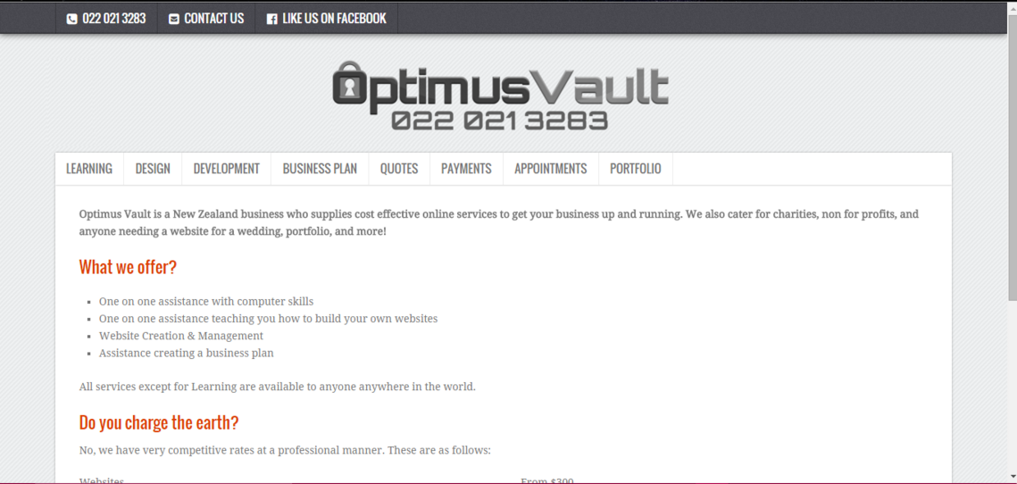
My first impressions of your website were pretty average. The page looks plain to me, but in some cases that can be a good thing. I strongly prefer a little plain over an overly crowded home page that has WAY too much information on it to even be able to comprehend what the website is about.


navigability.png
Website Usability: (9 out of 10)
I think your website has great potential. I really like how you have each tab that describes everything on the site, how it works, etc.

I do have one question. I noticed at the bottom of the home page under feedback, you have a quote there. Is there supposed to be two quote marks there instead of one or is that how you meant it?


activity.png
Business Sensibility: (9 out of 10)
I personally think you are providing a service that could be useful for a lot of people. I know a lot of people that need help starting their business, and with themes, graphics, etc., and it's awesome that you're offering a service with such great deals. You actually understand peoples situations too, and I think that will help you get business.


site%20structure.png
Site Structure: (18 out of 20)
The site structure, overall is good to me. It is easy to navigate through, and nothing is confusing. You have everything you need to know up on the top, and you also show a few samples of other projects you've done. I didn't have any problems finding anything on your website, so hopefully other people won't either. I do think you could combine the quotes and appointment tabs together, though. It would save room at the top and they would go better together.


design%20quality.png
Design Quality: (17 out of 20)
As I was saying above, the overall design of the website is pretty simple and plain. The colors are easy on the eyes, and the logo fits very well with your theme, though. I won't say too much about it because I know you just got a new theme, you could still be editing it or things like that.

I do have one suggestion, but I'm not sure how well it would work out. Have you thought about centering your logo in the middle of the page? It would look like this:
261bce1321be7b848c884cff05ed6b45.png


I'm not sure if you're a fan of that, it is just my personal opinion that it being centered looks a lot better and more professional.


originality%2016x16.png
Originality: (10 out of 15)
I think overall, the website isn't that original, however, you do offer better services than most websites I have seen, the prices are lower, and you offer better deals that any other website I have seen. That's really all I have to say in this section. If you continue coming up with unique/different things, and offering great deals, you'll definitely stick out from other websites like yours.


spelling%20grammar%20professionalism.png
Spelling, Grammar & Professionalism: (7 out of 15)
While reading on your website, I did see quite a few grammatical issues that should be fixed. I will list a few of them.
V0jT9u8.png


w4YjTjS.png

In this, there isn't really anything particularly wrong, it's just I think you could reword the sentence a little better. Maybe you could put "We also offer One on One tutoring services. Click the Learning tab if you'd like to take advantage of them!"

I am confused where it says "Do you charge the earth". Can you please explain what that means a little better?

Moving on to the next tab,
4UV1b9Y.png
There should be a period after "etc".

This will be the last one that I point out, it's on the Development tab.
plWVOFP.png

I've went ahead and highlighted what words are spelled wrong/worded wrong and offered some suggestions on how you could reword it.
7Ek5QTo.png


I definitely think you should go back and reread all of the pages because I didn't list all that I have found. It is important to make sure the grammar and spelling is perfect on your site if you want to maintain a professional aspect.


Thing you liked best about website: I liked the products/services the most and how understanding you are with everything.

Thing you liked least about website: I'm not a huge fan of the theme as I said above, but I'm just happy it's not crammed with a ton of things like some other websites I have seen in the past.


Overall Mark: (75 out of 100)
I really think your website has great potential. I really hope you take my advice. I'm sure you'll do even better! Good luck! 🙂

 
Centering the logo has been a thought but the theme allows for a logo to be displayed on the right hand side for advertising purposes so I haven't fully decided what route I want to go yet. Plus if I do go for a logo only I will be contacting my design specialists to provide a logo that goes full width, or at least does something a bit more decent than the current logo.

The quote marks... I'm not sure why there is two. I use the standard <blockquote> tags but if it was a nuisense to more people I would code something.
 
Yoda said:
Centering the logo has been a thought but the theme allows for a logo to be displayed on the right hand side for advertising purposes so I haven't fully decided what route I want to go yet. Plus if I do go for a logo only I will be contacting my design specialists to provide a logo that goes full width, or at least does something a bit more decent than the current logo.

The quote marks... I'm not sure why there is two. I use the standard <blockquote> tags but if it was a nuisense to more people I would code something.

The quotes are really what I wanted to know about. I had a feeling you used the block quote, I just wasn't sure. 🙂
 
I'm working on providing testimonials in a better form. Although, since I've been sick the past couple of days I haven't worked on my site.
 
Yoda said:
I'm working on providing testimonials in a better form. Although, since I've been sick the past couple of days I haven't worked on my site.

I understand. 🙂
 
Back
Top Bottom