Review for ConvertForFree.com

Not a huge fan of the theme/appearance to be honest. It looks a bit simple and I'm sure that you could maybe get a more modern look. I'm not a huge fan of sites that have pop-up advertisements when you click a link either so when that happened it puts me off the site completely as it can be spam/dangerous for viruses. Your converters work and some great ones offered too. Good luck with it 😉
 
ET should get to this soon, be patient. ^.^

Anyway, back to a review, I also agree with Kingcool. The theme isn't really appealing, could use more of a modern touch. It's simple, it is, however a more modern-ish theme would be nice. Other than that, I like the site and you have a ton of converters so that's awesome. ^.^ Just more of a modern touch to the website and you'll be golden. 😀
 
Your Review is In Progress!


Thank you for requesting feedback. I have tagged your thread, and will finish an official review within at most 72 hours. In the meantime, you will receive informal feedback from other reviewers and members at Forum Promotion. Once your official review is complete, you will be free to ask questions and receive feedback so long as your website remains only, and this topic remains reasonably active. You will also be able to request a re-review 14 days after this review is completed.


ConvertForFree.com
http://www.convertforfree.com/
Review by Joshua Farrell


new-icon.png
First Impressions
[note]========== BEGIN - First Impressions ==========[/note]
My first impressions of your site, is that of seeing that everything fits together for the type of site you are presenting. It has a good blend of colors, it isn't too wide, has a fixed width, it even has an About Us and Contact Us page. You don't have ads plastered all over the place, and the ads that I do know about, is the game ad at the bottom of every page and an annoying first visit Popunder. Having Popunders (or even a Popup) as ads, even if they are only shown once, can cause people to not want to visit again, or dig into the site, thinking that there might be more of them as they browse your site. Even though you can earn allot from them, they are not a good idea to have, to keep visitors staying on your site longer than they have to.

Testing Mobile Friendliness, I can tell you had in mind that everyone would be wanting to access your site, without issue to their device or computer.

So my suggestion in regards to First Impressions, is to get rid of that Popunder, since it can and will cause you issues in the future, for those who would spread word about your site.
[note]========== END - First Impressions ==========[/note]
Average


hammer-screwdriver-icon.png
Site Structure
[note]========== BEGIN - Site Structure ==========[/note]
Your site needs some restructuring. Generally speaking, the short intro to any site like yours, needs to be above the things you are introducing. This should have been the first thing you should have done, after adding all of the converters you wanted on the site. Having the introduction description of your site on the homepage at the bottom, is the first thing you need to move to the top of the page. Also consider shorting it, since some of that information you have there, is also on your About Page. This is needed on every page that you have a description on. So please work on fixing this, since most people won't look at the bottom of the page, for a description about what they are using.

Also consider lowering the Header Links you have, to something along the lines of <h2> or <h3>, since having it at that size is horrendous for the site structure.

If in the future you decide to work on making the converters more available, you could try making the list show up as columns. Similar to the "All Conversions" Page, but less spread out, and put into a more condensed list.

Though it is easy for me to use the site, the above is what I have to suggest, to make it easier for first time viewers.
[note]========== END - Site Structure ==========[/note]
Average


star-1-icon.png
Originality
[note]========== BEGIN - Originality ==========[/note]
I do not know how original you are trying to be, but it appears as if your site is one of tons of converter websites out there. There are plenty of different websites out there that are much more established than yours.

My suggestion, is to go out and search various different conversion websites, and see how they run their websites, then see what you can do to make yours different than theirs, other than the fact that you have all of the various conversions and converters that you can use for free.

Questions to ask for, in order to help make it more unique, are:
  • Can what I have in mind, be shown better?
  • How can I draw attention to my site and have people use it, when there are already so many options out their for what I have?

Can what I have in mind, be shown easier better?
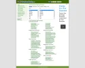
Definitely! if you do decide to go with a sidebar format, here is one example of a converter website that has everything you need to convert, right at the top, without anything getting in the way. Now I don't recommend doing a direct copy of their format, since that won't be unique, but it is a suggestion on how you can display your converters. And this example reinforces my suggestion about condensing the list of converters into a smaller display list.

Example:


How can I draw attention to my site and have people use it, when there are already so many options out their for what I have?

Simplicity of use, and size of content displayed. All in all, what is better about the above example, that you could improve on? How everything is right there, and easy to read. It is just that simple.

I suggest looking for a way to make it easier to find the converters, and have them displayed in such a fashion, that it doesn't force me to do a search for the converter I want to use, rather than to keep digging through the lists, hoping I stumble upon it. Also, I cannot stress text and link size enough! If the text and link size isn't at the right size, it forces the converters to be further down the page than they need!

If you can come up with a good plan on the above, I bet your traffic will increase greatly.

[note]========== END - Originality ==========[/note]
Poor


Final Remarks
You have a good idea on a website that has potential. It has the ability to draw traffic, just for the fact that you typically have more converters, than most websites I have seen. If you consider what I have suggested, you might be able to draw a crown large enough to become a future converter that I will use in the future, over some of the more established ones I tend to use.

Hope it goes well for you.​


Your Score
bc9658d.png
bc9658d.png
8496388.png
0b28c22.png
0b28c22.png


Attachments

  • Unit Converter 2015-08-31 10-45-48.webp
    Unit Converter 2015-08-31 10-45-48.webp
    153.1 KB · Views: 105
Cash has been Deducted!


Thank you for using the Forum Promotion review service. We have deducted 100 FP$ from your account in exchange for conducting a Standard Review. You can request another review in 14 days.

 
JF said:


So my suggestion in regards to First Impressions, is to get rid of that Popunder, since it can and will cause you issues in the future, for those who would spread word about your site.

I removed the popunders, so now you can you the site without an issue.
 
Re: Online Conversions

gamestoenjoy said:
Site URL: http://www.ConvertForFree.com
Date Opened: About a year ago
Review Type: Advanced
Extra Notes: I hope you find the site to be useful for you 🙂

Merged your new topic with the one that was still marked as active, since it was still open to review. If you want to request a new review, or the Advanced review, please do so in the Re-Review Request Thread.
 
Your Review is In Progress!


Thank you for requesting feedback. I have tagged your thread, and will finish an official review within at most 96 hours. In the meantime, you will receive informal feedback from other reviewers and members at Forum Promotion. Once your official review is complete, you will be free to ask questions and receive feedback so long as your website remains open. You will also be able to request a re-review 30 days after this review is completed.


Convert For Free
Review by Kino


new-icon.png
First Impressions
[note]========== BEGIN - First Impressions ==========[/note]
So at a first glance I see everything I was prepared for when I read "Convert For Free." I expected everything I see, which is good. Everything looks clean and simple. I can clearly see tabs that I could use to find exactly what sort of conversion I was looking for. I'm happy with everything for now. However, I do see some typos in big blocks of texts that I will mention a little further in the review.
[note]========== END - First Impressions ==========[/note]
Excellent


page-white-paste-icon.png
Design Quality
[note]========== BEGIN - Design Quality ==========[/note]
Your design is very plain and simple. For your niche, I think this works. Sometimes I complain to people about their lack of quality in the design. However, with a site like yours, you can't really get too fancy or you get away from the main point of the site. So from a first glance, I like the design.

The one thing I would re-do is your banner. To me it looks blurry. I want a crisp and clear banner right from the start when I visit a site. It sells the site and with it being blurry it doesn't really do much marketing on your behalf. See if you can make it a little more high quality. A good way of doing this is creating the image on a huge scale and then shrinking it down. This way all of the good quality remains in the image.

I like that everything is laid out right from the get go. The images you have next to the "Unit, Math, Text, etc." are real nice. They definitely add a little bit to the quality overall.

Overall, nice and simple design. It's not overwhelming and I think it helps people navigate to what they need. Nice work.
[note]========== END - Design Quality ==========[/note]
Good


Stats-icon.png
Business Aspects
[note]========== BEGIN - Business Aspects ==========[/note]
I guess here lies my issues. Business-wise, how are you making money off the site? I'm curious to see what the traffic of your site is (if you want to provide it in a PM I'd love to look). You have something real nice here. People are always looking to convert something to something else quickly. But with Google's new feature where it pops up right under the search bar, it might be hard to compete with them since they're established. Not to mention all of the competition from other older converter websites.

I think you should throw some more ads on the site to generate revenue. Normally sites like this exist solely for the purpose of making money. I don't think adding another ad somewhere on the site is a real bad idea.

Also, did you have to pay for the converter software or is it something free you can just find online? Just wondering if you would ever have any copyright issues if the codes you had for your converters were not paid for or given to you legally. I am NOT accusing you of anything, simply just curious on my end.
[note]========== END - Business Aspects ==========[/note]
Average


star-1-icon.png
Originality
[note]========== BEGIN - Originality ==========[/note]
This is probably your weakest element in the review. There are tens of thousands of converter sites on the web. I love the effort you have put into designing the site and you've done a nice job. As to a measure of if you'll ever see huge amounts of traffic, it might be unlikely. Again, like I mentioned with the Google, it's hard to compete.
[note]========== END - Originality ==========[/note]
Poor


hammer-screwdriver-icon.png
Site Structure
[note]========== BEGIN - Site Structure ==========[/note]
I think your site is structured very well. You really do a nice job of clearly showing people how to find what they need quickly and efficiently. I know that if I needed to convert cups to ounces, I would click "Math" and find it in there. I don't have too much to say here because it is structured well and I'm happy with what you have presented me.
[note]========== END - Site Structure ==========[/note]
Excellent


page-edit-icon.png
Spelling & Professionalism
[note]========== BEGIN - Spelling & Professionalism ==========[/note]
Here is where I found quite a few flaws. There is some content that you have written that has missing words and some grammatical errors. I will give you one example in the spoiler below:

ORIGINAL:
Looking for specific conversion or calculation? You are definitely in the right place! Our site contains variety of them in different categories including units, math, text, date and more.
Using this online tool is the best option because you don’t need to install anything and expose your device to malicious software, and you can access this tool from every platform including desktop, mobile phone and tablet using the internet and get the same interface. It performs tedious calculations in a click of a button and never makes mistakes like human often do.

We have many useful converters and calculators, and we keep adding new ones per your requests. All of them are free and available online, so keep visiting and supporting us!

CORRECTED:
Looking for a specific conversion or calculation? You are definitely in the right place. Our site contains a variety of conversions in different categories, including: units, math, text, date and more.
Using this online tool is the best option because you don’t need to install anything and expose your device to malicious software. Also, you can access this tool from every platform, including: desktop, mobile phone and tablet using the internet, and get the same interface. It performs tedious calculations with a click of a button and never makes mistakes like humans often do.

We have many useful converters and calculators and we keep adding new ones per your requests. All of them are free and available online so keep visiting and supporting us.

Just be aware that how you spell things affects your professionalism and overall excitement users have using the site. Think about this for me. If a user comes on and reads the description of the converter they choose and see grammatical and spelling issues, don't you think they might assume that maybe the calculations you're offering might be flawed as well? Just food for thought. Definitely go through and re-write all of your descriptions because I found spelling errors and missing words in almost all of them.
[note]========== END - Spelling & Professionalism ==========[/note]
Very Poor


Final Remarks
Overall, you have a pretty nice site. What really knocked down this review is the lack of originality on the site and the lack of care in your spelling and grammar. What the site is supposed to do is convert things for people and that goal is accomplished. That is why in the categories regarding the overall layouts and all that got high ratings. However, as a reviewer we look at the whole picture and some parts were definitely missing.​


Biggest like about the website?: Smooth navigation, clean design, good name
Biggest dislike about the website?: Lack of professionalism in spelling & lack of originality
What could I do to make you (the reviewer) join my website?: I would use your site.


Your Score
3%20stars.png

 
Thank a lot, great review!

I will work on the points that you have mentioned by fixing the spelling and grammar, and will think on how to provide more original materiel.

Regrading your questions, currently the site has around 500 visits per day, not much but growing every month.
I have no copyright issues as all the converters and calculators are original, and were written by me.
 
If you want to advertise you site and get brand visibility. I suggest that you invest in advertising using CPM campaigns. You can do that by using Bluagile's self-serve RTB. The good thing is that since it's self-serve and Bluagile has their own DSP they're connected with a lot of ad exchanges which is good for getting more traffic for your site.


FREE WITH COUPON CODE
Cash has been Deducted!


Thank you for using the Forum Promotion review service. We have deducted 100 FP$ from your account in exchange for conducting a Standard Review. You can request another review in 14 days.

 
Tetriiix said:
If you want to advertise you site and get brand visibility. I suggest that you invest in advertising using CPM campaigns. You can do that by using Bluagile's self-serve RTB. The good thing is that since it's self-serve and Bluagile has their own DSP they're connected with a lot of ad exchanges which is good for getting more traffic for your site.

Thanks, I will try it.
 
Back
Top Bottom