USHost247 New Look

USHost247

Madly Diligent
Joined
Jul 8, 2009
Messages
8,102
Reaction score
1,036
FP$
5,440
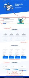
I have been working on a new look for USHost247 to make it simpler, cleaner, and to the point.
Our previous theme was 7MB on the homepage, which was terrible.
We have forwarded our domain to https://www.ushost247.com/home and kept our client area in the same location.

This theme is still a work in progress and little tweaks here and there will still happen over the next week or so.

Please let me know if you see anything that isn't displaying correctly or linking correctly and I will fix it as soon as I can!

Check it out, https://www.ushost247.com
 
I like the new theme a lot. It feels more professional in every way. Great work Chris!🙂
 
Super awesome! I just checked it out on mobile and it looks great there too. As Jerlene said, I've gotten to see this company shape itself and this was a great next step.
 
Not as busy as the last theme and I like it. Busy as in not allot of information
 
Not as busy as the last theme and I like it. Busy as in not allot of information

That was the biggest complaint of our other theme. It was hard to find information. That’s why I opted to have it as basic as possible!
 
This looks great! The color scheme, font choice, and UI are overall very clean. The animations are also well done. I found information easy to understand, and the page flowed naturally.

I do have some thoughts, attached. Hopefully they're helpful!
 

Attachments

  • ushost247.com_home_.webp
    ushost247.com_home_.webp
    228.3 KB · Views: 69
This looks great! The color scheme, font choice, and UI are overall very clean. The animations are also well done. I found information easy to understand, and the page flowed naturally.

I do have some thoughts, attached. Hopefully they're helpful!

Thank you for the detailed feedback! I will definitely work on correcting those issues!
 
I didn't know you were working on this, and I am definitely impressed with this. USHost247 looks so much better! The design looks modern and professional.

This looks great! The color scheme, font choice, and UI are overall very clean. The animations are also well done. I found information easy to understand, and the page flowed naturally.

I do have some thoughts, attached. Hopefully they're helpful!

I agree with these suggestions. 🙂
 
I didn't know you were working on this, and I am definitely impressed with this. USHost247 looks so much better! The design looks modern and professional.
He was surprising you, He had to make the site look professorial to make FP look good 😛
 
I like the redesign. In fact I was looking for something like this for my portfolio. It has a nice blue color branding. Loved it.
 
The blue seems to be too blue for me, can it be lighter like we have in FP Post Reply color. Just a suggestion 🙂
 
Great work @ChrisGrigg, I agree with @ebbymac here, other than those fixes, it looks amazing! Congrats on the new theme. :bluesquarerolleyes:
 
Last edited:
I like the new theme. Congratulations on releasing a new update to the community! Looks great.
 
Back
Top Bottom