

You are using an out of date browser. It may not display this or other websites correctly.
You should upgrade or use an alternative browser.
You should upgrade or use an alternative browser.
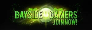
Which banner is better?
- Thread starter Page
- Start date
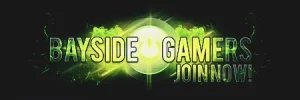
Agreed 🙂Devster said:I prefer the first one, the text stands out better so makes it easier to read
glassmaster
New Arrival
Absolutely Correct
Most people are licking the first one 🙂Sharon said:In my opinion the first one seems a bit more clear. The second one seems a tad bit too bright. Everyone's screen setting might be different though.
I think the second one is better, the brightness of the first one is not pretty good though.This
Or
ATiRAGEPRO
Reputable
I say the second one is better. The text is highlighted, making it stand out more from the background.
Well it's green and you are being told by Mr banner 😛 Well the truth that I haven't even used it, well maybe on FacebookI don't like anything that tells me to "Join now!" as it seems quite demanding and I don't let banners tell me what to do. 😛
Agree also 🙂I prefer the second one 😀 The text is easier to understand and read
haha, Consider that this is an old topic now.I prefer the first one, I know when i mention here, you decided already LOL
About Us
Since 2007, Forum Promotion has specialized in providing advertising solutions to webmasters looking to promote their communities. We pride ourselves in being the bridge that connects forum administrators, bloggers, and more.
Affiliates


