I am wanting to give some padding to the thread lists title cells between the Avatar cell and the title cell.
So I set this in extra.less and it works beautifully...... except in narrow responsive screens like phones for example.
As I collapse the screen down to the smallest responsive display (or view on my phone), the code above no longer gives me the desired padding that the code gives between the avatar and on thread title cell. And in my opinion does not look pleasing at all to me.
I started experimenting with conditionals and methods and basically I ended up with a mess.
Maybe someone hopefully has the solution to assist me from going stark raving crazy.
Xenforo 2.3 (theme based off OEM XF theme in dark mode)
Issue shown in responsive narrow on Whats New and thread lists in forums nodes.
You can view what I am looking at on my Whats New page for a live example.
Collapse your screen and view the responsive transitions down to narrow (or view on phone device).
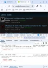
edit to add: logging in is not required, but the issue is much more apparent logged in when you have the avatar, and your reply avatar overlaid. It appears way too crowded.
screenie added for logged in view in mobile/narrow view:

This is the desired look as seen on the next step up responsive view:

So I set this in extra.less and it works beautifully...... except in narrow responsive screens like phones for example.
Code:
.structItem-cell--main {
padding: 5px 10px 5px 20px;
}
As I collapse the screen down to the smallest responsive display (or view on my phone), the code above no longer gives me the desired padding that the code gives between the avatar and on thread title cell. And in my opinion does not look pleasing at all to me.
I started experimenting with conditionals and methods and basically I ended up with a mess.
Maybe someone hopefully has the solution to assist me from going stark raving crazy.
Xenforo 2.3 (theme based off OEM XF theme in dark mode)
Issue shown in responsive narrow on Whats New and thread lists in forums nodes.
You can view what I am looking at on my Whats New page for a live example.
Collapse your screen and view the responsive transitions down to narrow (or view on phone device).
edit to add: logging in is not required, but the issue is much more apparent logged in when you have the avatar, and your reply avatar overlaid. It appears way too crowded.
screenie added for logged in view in mobile/narrow view:
This is the desired look as seen on the next step up responsive view: