First Design in few months

Taz

Seasoned Veteran
Joined
Mar 1, 2009
Messages
3,652
Reaction score
2
FP$
1,032
File Name -Not Sure
Description -
Author Name - Taziamoma Abraham
Additional Information - I haven't designed in a few months because of work, so I decided to get back into it. I tried to do something like FP. Keep in mind that this is my third full website design.
Preview/Demo -Attached

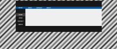
The light gray over the "Home" sidebar is a mouseover.
 

Attachments

  • design.webp
    design.webp
    54 KB · Views: 310
Not bad, I would recommend using a different background image though. That one is a little trippy 🙂
 
ShadyX said:
Not bad, I would recommend using a different background image though. That one is a little trippy 🙂
Thanks. The background was me just experimenting. I'm thinking of just having an image with a little noise.
Darthmaul said:
ShadyX said:
Not bad, I would recommend using a different background image though. That one is a littlequite trippy 🙂
FTFY
What's FTFY?
 
What type of background would you prefer? One color? Or pattern?
 
White square in middle should have padding on the right or something.
Stripes are hard to look at.

Too much space on the bottom, not enough on top.
 
Ah yes, I am having a tough time centering it in the middle of the page.
 
The container. I'm trying to put the whole block in the center of the page. I managed to center it horizontally, but I need to center it vertically.
 
I'm trying to center the whole block in the middle of the page. I managed to get it centered horizontally, but now I'm trying to get it centered vertically.
 
Sorry for the bump, but I saw this was never replied to.

Centering vertically is a lot of work and can almost always be unreliable.

To be honest, I would just give it around a 150px margin to the top if you want it to be down the page.
 
😀 Thanks, although I still have a lot to learn, you have to start somewhere right?
 
Back
Top Bottom